Home page sections
Build the home page from sections. Add, edit, reorder and hide them in the admin area.
Go to Configuration → Local plugins → Forma theme core → Configure and click Edit home page sections.
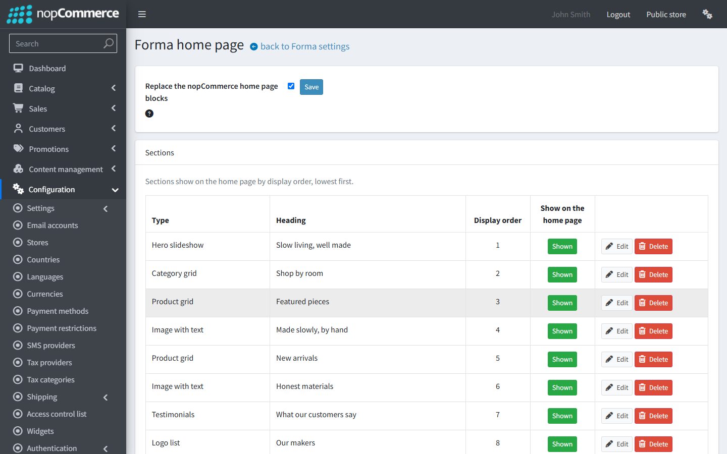
Replace the nopCommerce home page blocks
Tick Replace the nopCommerce home page blocks and click Save next to it to hide nopCommerce’s own home page text, categories, featured products and bestsellers, so only Forma’s sections show.
Widgets placed in home page zones still show. If your store was installed with sample data, its Swiper slider shows under Forma’s sections. Turn it off in Configuration → Widgets when Forma’s hero replaces it.
Add, order and hide sections
- Add a section: below the list, choose a section type and click Add section.
- Edit a section: click Edit to set its content and display order.
- Display order: sections show by display order, lowest first, like categories and products in nopCommerce.
- Shown / Hidden: click the button to hide a section or show it again. A hidden section keeps its settings.
- Delete: removes the section and its settings. To keep the settings, hide the section instead.
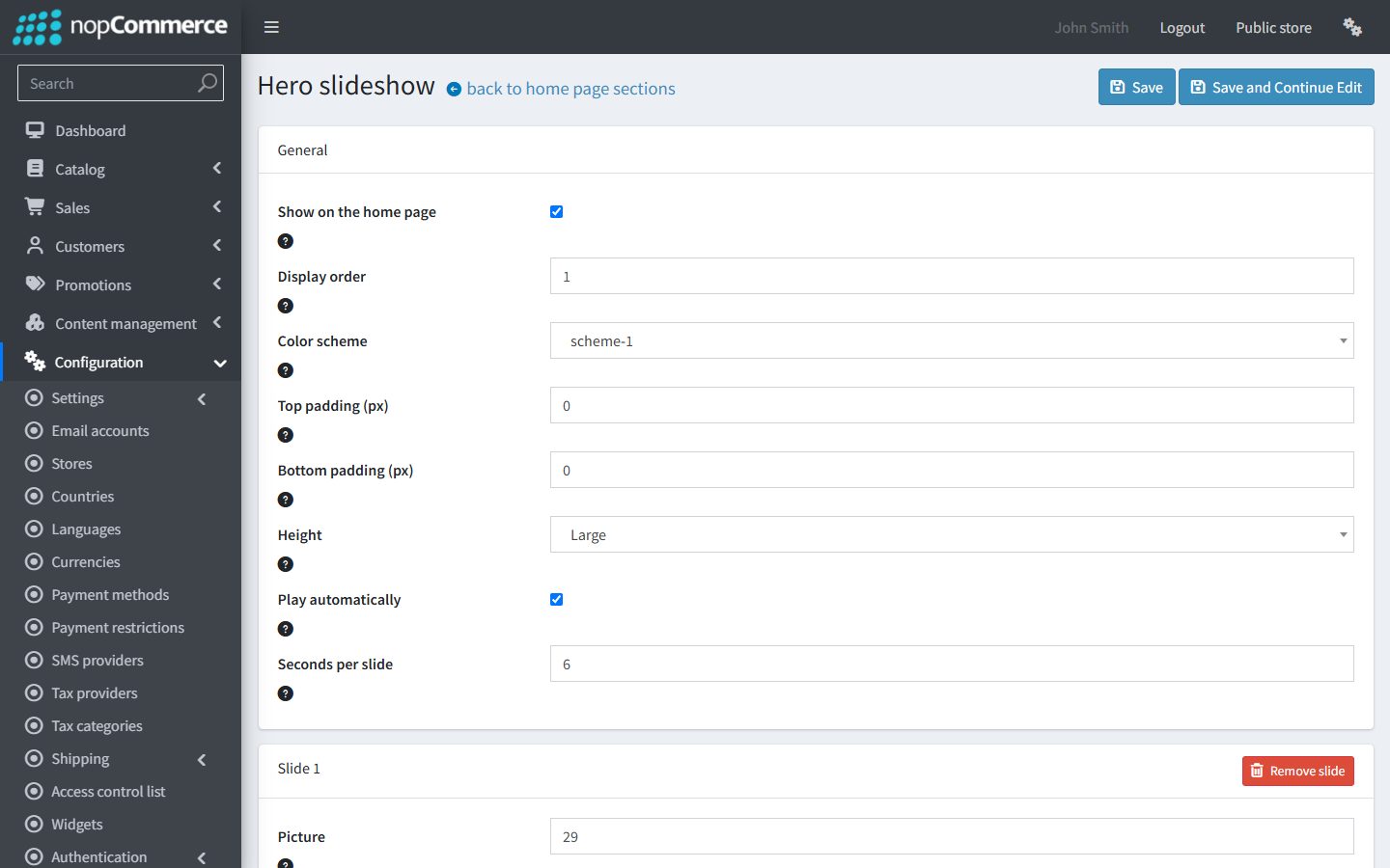
Settings every section has
| Setting | What it does |
|---|---|
| Show on the home page | Untick it to hide the section. Hidden sections keep their settings. |
| Display order | The section’s position on the home page; the lowest shows first. |
| Color scheme | One of the six color schemes. |
| Top padding (px), Bottom padding (px) | Space above and below the section on desktop, from 0 to 200. Tablets and phones use less. |
Every section except the hero slideshow also has a heading area:
| Setting | What it does |
|---|---|
| Eyebrow | A short label above the heading. |
| Heading | The section heading. |
| Subheading | One line under the heading (sections without a Text field, and Rich text). |
| Text | Rich text (Rich text, Image with text and Newsletter). |
| Button label, Button link | Leave the label empty for no button (Product grid, Rich text, Image with text). The Newsletter section has a button label only: its button submits the form. |
| Text alignment | Left, center or right. |
Section types
Hero slideshow
Full-width slides with text on a picture.
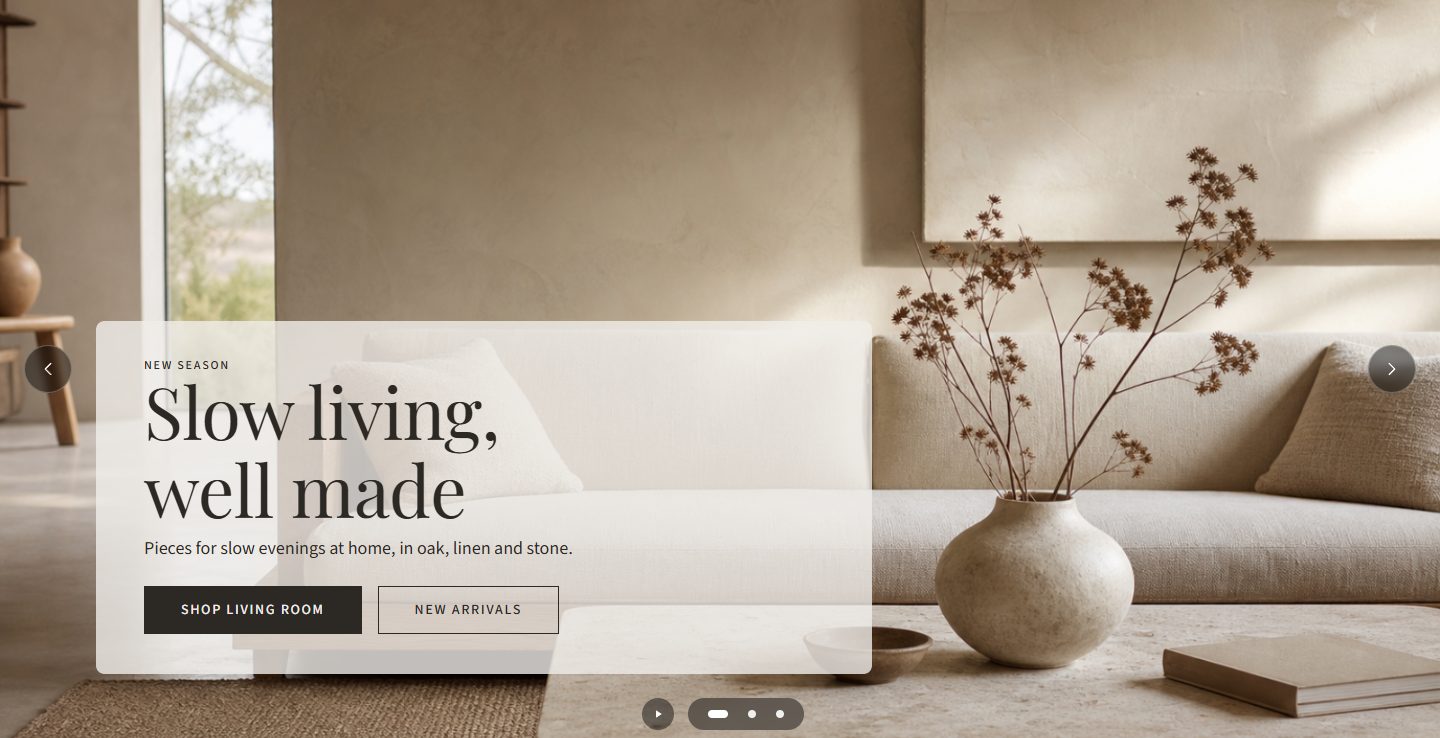
- Slides: each slide has a picture, an eyebrow (short label above the heading), a heading, text, two buttons (label and link), a text position (top, center or bottom; left, center or right) and a Text box opacity (%) from 0 (none) to 100. Use Add slide and Remove slide to manage slides.
- Height: Small, Medium, Large, or Picture proportions.
- Play automatically: moves to the next slide by itself; shoppers can pause it. Seconds per slide sets the speed, from 3 to 20.
Upload hero pictures at least 2000 pixels wide.
Product grid
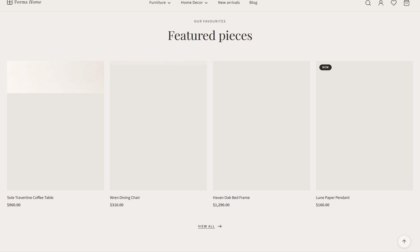
- Products come from one of:
- Shown on home page (product setting): the products with Show on home page ticked;
- Marked as new;
- Bestsellers;
- From a category: choose the Category.
- Number of products: from 1 to 24.
- Columns on desktop: from 2 to 5.
Category grid
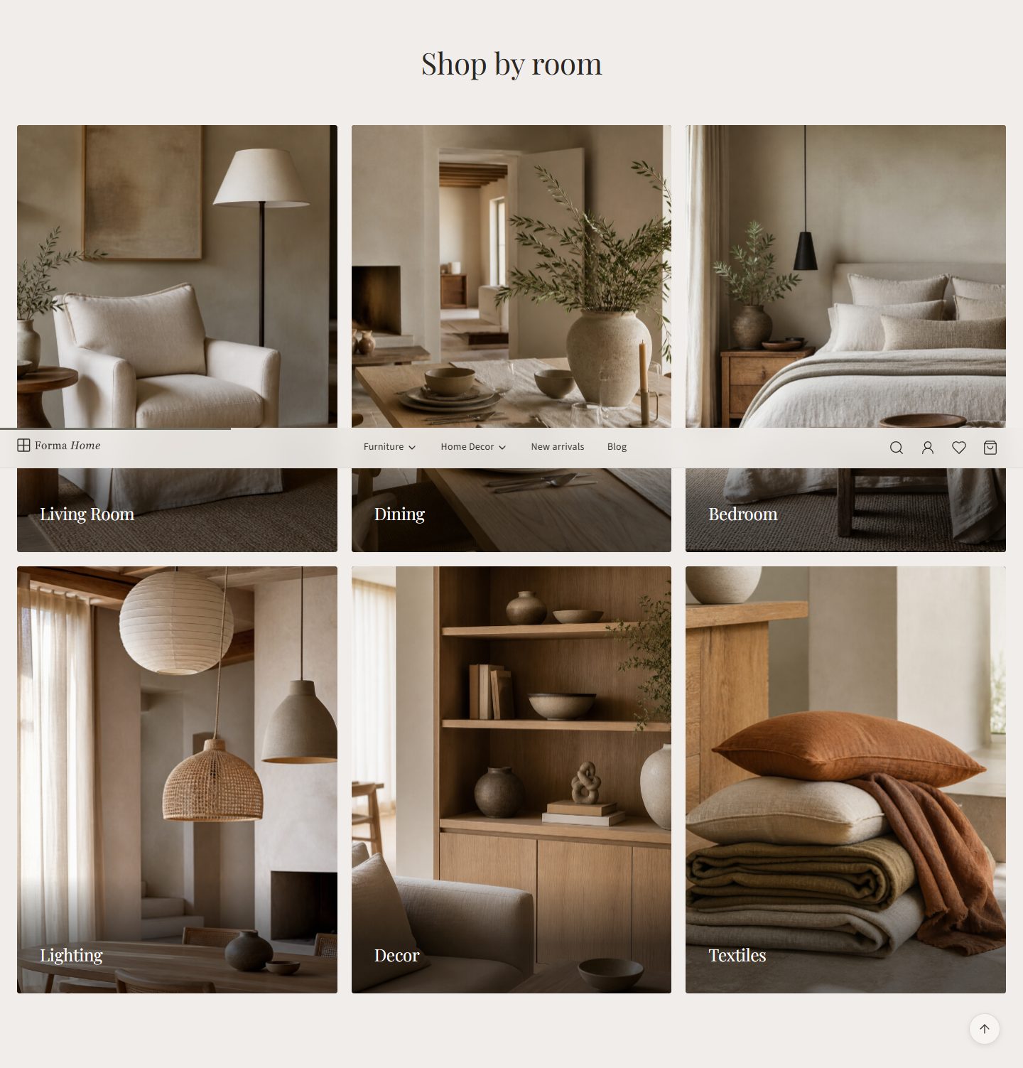
- Categories: the categories you choose, in the order you choose them.
- Leave it empty to show the categories marked Show on home page.
Image with text
A picture beside a heading, rich text and a link.
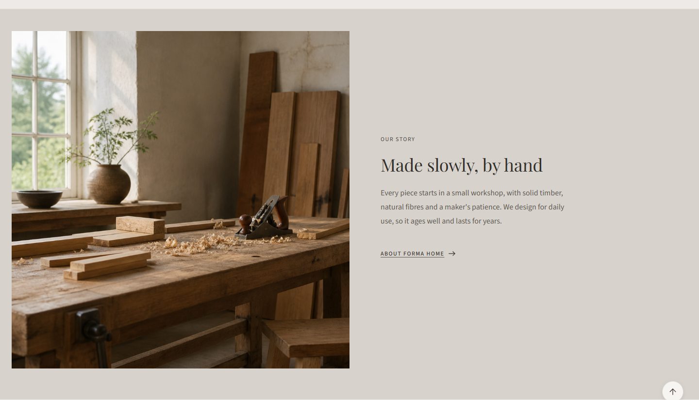
- Picture position: left or right of the text on wide screens.
Rich text
A heading and rich text, centered or aligned left or right.
Testimonials
Customer quotes.
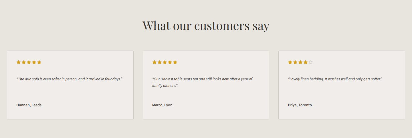
- Each testimonial has a Quote, an Author, a Rating (0 to 5 stars) and an optional Photo. Quotes left empty aren’t shown.
- Show stars: shows each quote’s star rating.
Logo list
Brand logos.

- Layout: a grid, or a scrolling row.
- Each logo has a Logo picture, a Brand name (read by screen readers instead of the image) and an optional Link.
- Logo height (px): from 24 to 160.
- Grayscale logos: shows logos in gray, in color on hover.
Newsletter
Subscribes visitors to your store’s newsletter: the same list as the footer box.

- Layout: text beside the form, or everything centered.
- Note under the form: plain text, for example a privacy note.
If your store asks for a captcha to subscribe, the section shows its text without the form, and the footer box takes the subscription.
Languages
When your store has more than one language, the section form shows a Standard tab and one tab per language for every text, also inside slides, testimonials and logos. Leave a translation empty to use the standard text.
A language you add later starts without translated strings for nopCommerce and for Forma. Import its language pack under Configuration → Languages.
Several stores
In a multi-store installation, each store can have its own section list. See Multi-store.